When designing a logo, there are certain rules that must be followed — and with good reason. These rules are in place to help businesses create a brand that will work for them, and, most importantly, for their target audience. Two very important principles of logo design are a) using only 2-3 colors for a logo, and b) not mixing 2 or more different fonts together in the same design. Using more than 3 colors for a logo can make the logo difficult to memorize. Additionally, using 2 or more fonts can cause confusion. Each font has a “personality” of its own, capable of evoking a wide range of emotions. Mixing these “emotions” together can leave the viewer confused about the message you are trying to convey.
These rules, however, can sometimes be broken. If done right, the outcome can be amazing. Here are 8 logos that I feel are successful despite the fact that they do not follow all the rules.
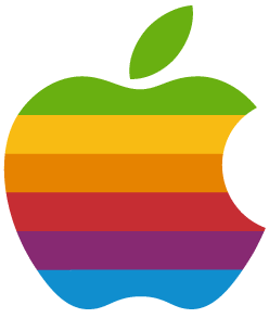
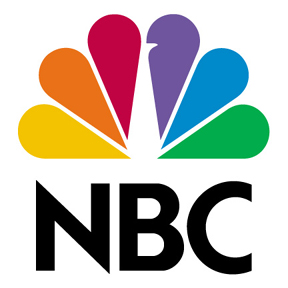
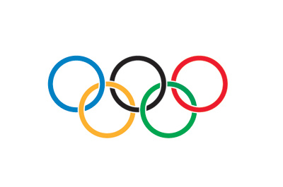
Logos with more than 2-3 colors
Apple’s old logo
NBC

Olympics
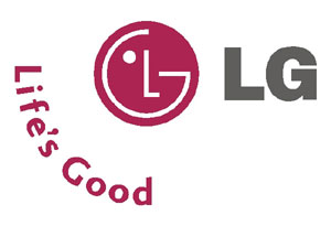
Logos with mixed fonts
SuprGlu

LG
MTV

Famous Logos — I had to throw this one in there 🙂