The professional successful baseball team, Atlanta Braves was founded in the year 1876 in the name of Boston Red Stockings. The team came to be known as the Atlanta Braves (“Braves” originates from a term for a Native American warrior in the year 1966. This American team is nicknamed as the Bravos”, and often self-styled as “America’s Team”. It is based in Atlanta, Georgia and creates a history of having the most memorable managers and pleasant stadiums, yet also that of upsetting losses and long emblem droughts.
Since its inception Atlanta Braves has been through a lot of ups and downs yet they have proved that they are the team that has always been there and will always be. Today it is one of the oldest continuously running baseball teams in Major League Baseball and is the only team out of twenty-eight that has fielded a team every single season.
In 2005, the Braves won their 14th consecutive division title. The team won the World Championship in 1995.
DESIGN ELEMENTS OF THE ATLANTA BRAVES LOGO:
The Atlanta Braves logo was first created by Boston Braves in 1946. Like many other baseball teams’ logos like those of NY-Yankees and Boston Red Sox, the logo of Atlanta Braves the logo of Atlanta Braves is very distinctive.
Shape and Font of the Atlanta Braves Logo:
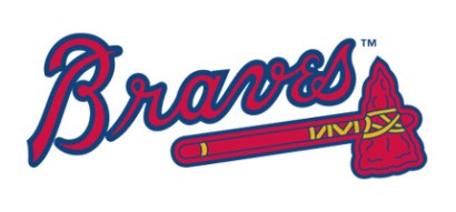
The Atlanta Braves logo comprises of an axe underneath the company’s name. The whole logo slants towards the right. The axe basically represents the strength of the team and its continuous efforts to improve its performance.
Color of the Atlanta Braves Logo:
Keeping aside the shape and the font style, the colors (red with a navy blue outline) in the Atlanta Braves logo have been used pretty sensibly perhaps indicating the team’s strength to recover from the lows with a bang.