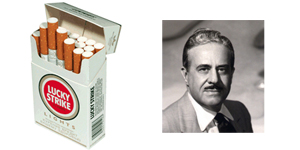
Raymond Loewy and Lucky Strike
[ad#adblock]
Known for his fiery personality and arrogant comments, nobody will argue that Raymond Loewy was very gifted as an industrial designer. In 1940 a bet of $50,000 was placed with Raymond Loewy that he could not increase sales of the Lucky Strike cigarettes by simply redesigning the logo and packaging.
Confident in his abilities he began re-design, his goal when designing was to make a logo that if seen just once would be imprinted in your memory, this was done using simplicity.
The first change on Lucky Strike was to change the background to white, and place the logo on both sides of the packaging, this would reduce printing costs as well as increase brand exposure. He changed the text around the package to smaller sizes to not distract from the new logo design and to provide a clean white background.
Needless to say he was awarded the $50,000 and increased Lucky Strikes profitability, not to mention created a design that is difficult to forget.
Do these design changes sounds familiar? White background… Google. Remove text on packaging to not distract… Apple. Designers today are still using the same design tricks Raymond Loewy was using over 70 years ago to increase profitability. Have we come full circle to simplicity, or did simplicity ever leave?
