Apple Computer, Inc. holds a significant position in the corporate world due to its paramount products ranging from computers to latest gadgets like iPods, QuickTime, Macintosh etc. The Apple logo is recognized as one of the most famous logos across the IT world, prominently because it forms the largest and most successful brand. It has been presented as a landmark company for more than 30 years from now, paving its way to further success.


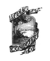
Besides the uniqueness of the Apple logo, it has an even more interesting history. The earliest Apple logo features Sir Isaac Newton sitting under the tree from where he derived his theorems of gravity. The apple itself in the Apple logo today symbolizes the identity of the Apple brand. Moreover, the Apple logo just before what we look at today, consisted of 7 colors of the rainbow, speaking of the separation of white light and the introduction of colors to the IT products. Another story that evolute behind the Apple logo is concerning the father of computing, Alan Turing who had committed suicide after eating a cyanide-laced apple. The Apple logo pays a tribute to the legend.
Design Elements of Apple logo:
The modern and unique design enables the Apple logo to standout the rest of the motifs to signify the quality standards it produces. The simple features of Apple logo appear clear in its design and depiction.
Shape of Apple logo:
The Apple logo characterizes an apple, with a bite taken from its right side. It also features a leaf tilted toward the right hand side. An apple is what the entire Apple logo consists of, speaking for its identity on its own.
Color of Apple logo:
The rainbow colors are now omitted from the Apple logo, instead it comprises of a silvery chrome polished apple. It appears as shiny and elegant in its layout, looking both stylish and modern.
Fonts of Apple logo:
There are hardly any fonts present in the Apple logo. If there are at times, they appear in a very simple manner, with clear and bold style saying ‘Apple’. Besides, the logo is so well-recognized and self-oriented that most of the times there seem no specific need for proper fonts describing the brand as diverse as Apple.
Related blog post(s):
Bad Fortune for the Fortune 500: Famous Logos totally ****ed up
The Evolution Of Logo Design In The United States
Logo Look-Alikes: The Clone Wars
8 Successful Logos That Break The Rules