The Evolution Of Logo Design In The United States

by admin on June 18, 2009


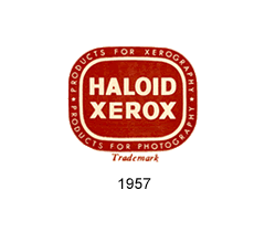
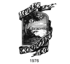
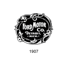
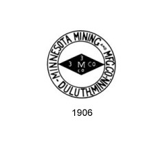
Take a look at most logos from the past and you’ll likely notice one thing– they all seem to lack structure. Most logos from earlier times appear very busy, cluttered, often illegible and just down right complex. These logos included detailed illustrations that, more often than not, resembled mini advertisements that told a company’s story. Over time, however, logos became much more simple and refined, making them more memorable and easier to recognize.

Apple

apple

Ford

ford

3M

3M

Xerox

xerox

Share and Enjoy:
  • Digg
  • del.icio.us
  • Facebook
  • StumbleUpon
  • Mixx
  • Google Bookmarks
  • Twitter

{ 2 comments… read them below or add one }

Rick June 23, 2009 at 5:03 am

Ford Logo reminds me of classic motion pictures lol

Roberta Seldon June 23, 2009 at 2:46 pm

Rick, the only thing missing from the Ford logo is the MGM lion, lol! Thanks for sharing.

Leave a Comment

Previous post:

Next post: