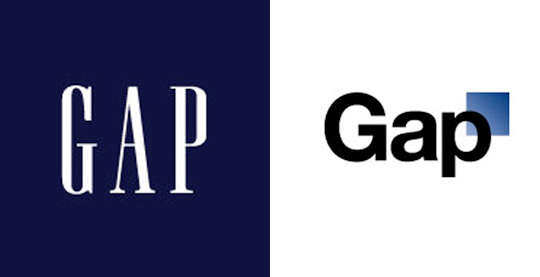
Established in 1969, Gap Inc clothing is one of the most popular American clothing brands in America. They recently decided to rebrand their company with the debut of a new logo, however the only problem with this new logo was the amount of social media backlash it received from various users on Facebook, Twitter & many other social media websites. The gap logo change sparked a lot of controversy and loyal Gap shoppers voiced their opinions loud and clear online. The new logo had the Gap name on a white background with a blue gradient square in the top right corner. Also, the font face chosen for the new logo was one of the most generic and overused logo fonts in the design world – Helvetica.
Shortly after the Gap logo change, On October 4th, 2010 GAP Inc. unveiled the new logo on their website (Gap.com). Spokesperson Louise Callagy said the company was going from “a classic, American design to modern, sexy & cool.” While some people at Gap may think of the new logo in this way, the out lash from users especially on the Twitter feed @GapLogo thought otherwise.
Gap Logo Change Crowd Sourcing Project
On October 6th, 2010 Gap Inc. posted on its Facebook wall “We know this logo created a lot of buzz and we’re thrilled to see passionate debates unfolding! So much so we’re asking you to share your designs. We love our version, but we’d like to see other ideas.” This opened the design world to submit their design ideas to Gap in hopes that their logo would be picked to represent the new branding of Gap, calling it a crowd-sourcing project. The project lasted about a week until Louise Callagy spoke to Bloomberg, letting everyone know that after much thought they decided to revert back to their iconic Blue logo and that the change would take place immediately. So, the Gap logo change was short-lived.
This sparked the question as to if this whole fiasco was just a publicity stunt to regain brand momentum. Gap Inc. was hoping the new logo would spark interest in their company again as sales in Gap stores across North American have seen a decline in the past 6 months. Gap owns other brands such as Banana Republic & Old Navy, both of which have been doing increasingly well as of late.
OOPS
The Gap logo change will definitely go down in history when it comes to re-branding. No other company re-branding has gone nearly as bad as Gap’s and hopefully they’ve learned from this and come back with a more effective strategy next time. It should be noted however that while Gap has created such an uproar about this new logo, it may have inadvertently increased its brand loyalty by reverting back to their original logo and giving customers the idea that their opinions and ideas matter to the Gap Inc.