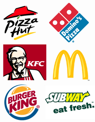
Drive down any street in America and you’re likely to see a similar scene. Whether it’s McDonald’s golden arches, Burger King’s bun halves, or the Hardee’s star, fast food logos all have one element in common– color. Take a look around and you’ll see that most fast food logos contain one or more of the following colors– red, yellow, orange, or green; particularly the former two. That’s because, according to the color theory, these colors are known to subconsciously trigger hunger and/or induce excitement. These colors encourage guests to spend more and leave quickly– which is exactly what fast food restaurants want you to do. Just how accurate is this theory? Research has shown that people eat more in a room with warm color surroundings as opposed to consuming food in a room painted in cold colors such as blue, black, or purple. As a matter of fact, studies have shown that these colors actually suppress appetite because they are associated with foods that may have become spoiled or foods that may be toxic. Still not convinced? Take a gander at the logos below. These guys obviously know what colors work best in their line of business 😉 . Happy eating!
Hardee’s and Carl’s Jr.
Wendy’s
Quiznos Sub Shop

Dairy Queen
Bojangles’
Denny’s
Sonic Drive-In
Jack In The Box
One thing I noticed about the logos of fast food chains are those red and yellow colors. I’ve come across one time that red, yellow and even orange are associated with spicy foods or something that is hot or deep fried. In some instances black is the ultimate. On the other hand what you said here is true. Thank you so much for posting this information. It has been so helpful. God bless.