Bad logos– we’ve all seen them. Some of us may even have been responsible for creating them. Nevertheless, these design disasters tend to show up every now and then. We can spot them by their busy, cluttered, unstructured, unprofessional appearance. The designs below are no exception. They are prime examples of how a poorly designed logo can ruin an otherwise reputable company name.
Check Point Security Software – This logo was supposedly designed by the CEO’s six year old daughter. I guess that explains everything ;-). Word to the wise, it’s generally not a good idea to let your child design the image that will represent your company. Because when it comes to potential customers, first impressions really are everything.

Instituto de Estudos Orientais – I think this one is self explanatory 😉 . Seriously though, this is supposed to be an oriental house in front of a setting sun, but I see something else entirely.

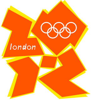
2012 London Summer Olympics – For some reason, this logo reminds me of a crumpled box of McDonald’s fries.

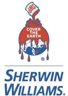
Sherwin-Williams – Sherwin-Williams’ earth-friendly logo. Let’s just hope it isn’t as harsh on the earth as it is on the eyes.

MobileMe – Apple’s new iPhone service. This design is way too cluttered. I’m sure the designer could have come up with just ONE icon to sum up all of MobileMe’s features.
